Getting a potential donor to visit your nonprofit’s campaign donation page can be a feat in and of itself. But it’s only the first step in the donation process. A well-designed and optimized donation page can make all the difference in getting supporters to complete their donation. Even better, implementing the right features on your page can encourage repeat support and help attract new donors to your nonprofit.
This blog shares three simple tips to optimize your campaign donation page and scale fundraising efforts.
1. Keep your Donation Page Simple and Straightforward

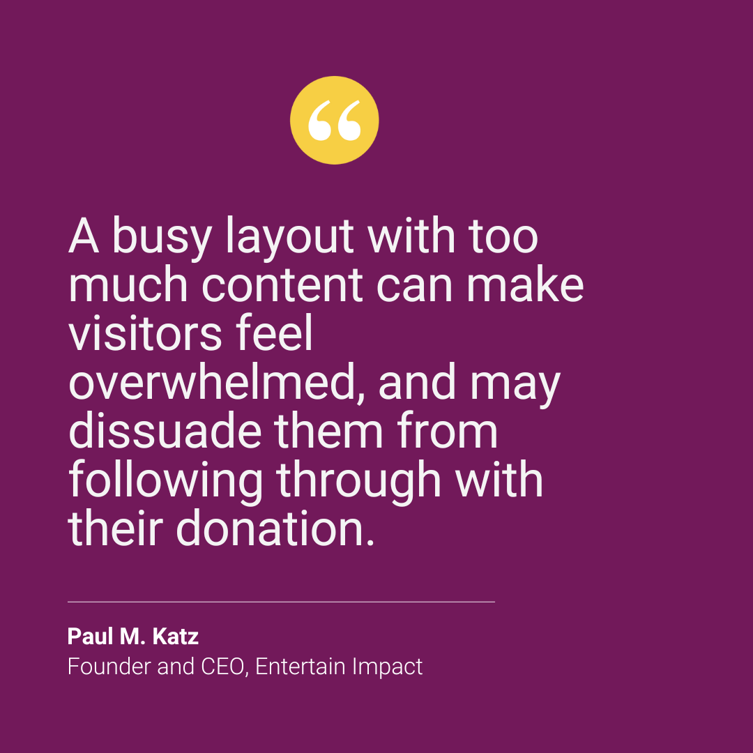
Simplicity is key when creating a donation page for your nonprofit’s campaign. A busy layout with too much content can make visitors feel overwhelmed, and may dissuade them from following through with their donation. Optimize your nonprofit’s campaign donation page so visitors can quickly find the call to action leading them to give their gift.
Generally, a nonprofit’s campaign donation page should have the following:
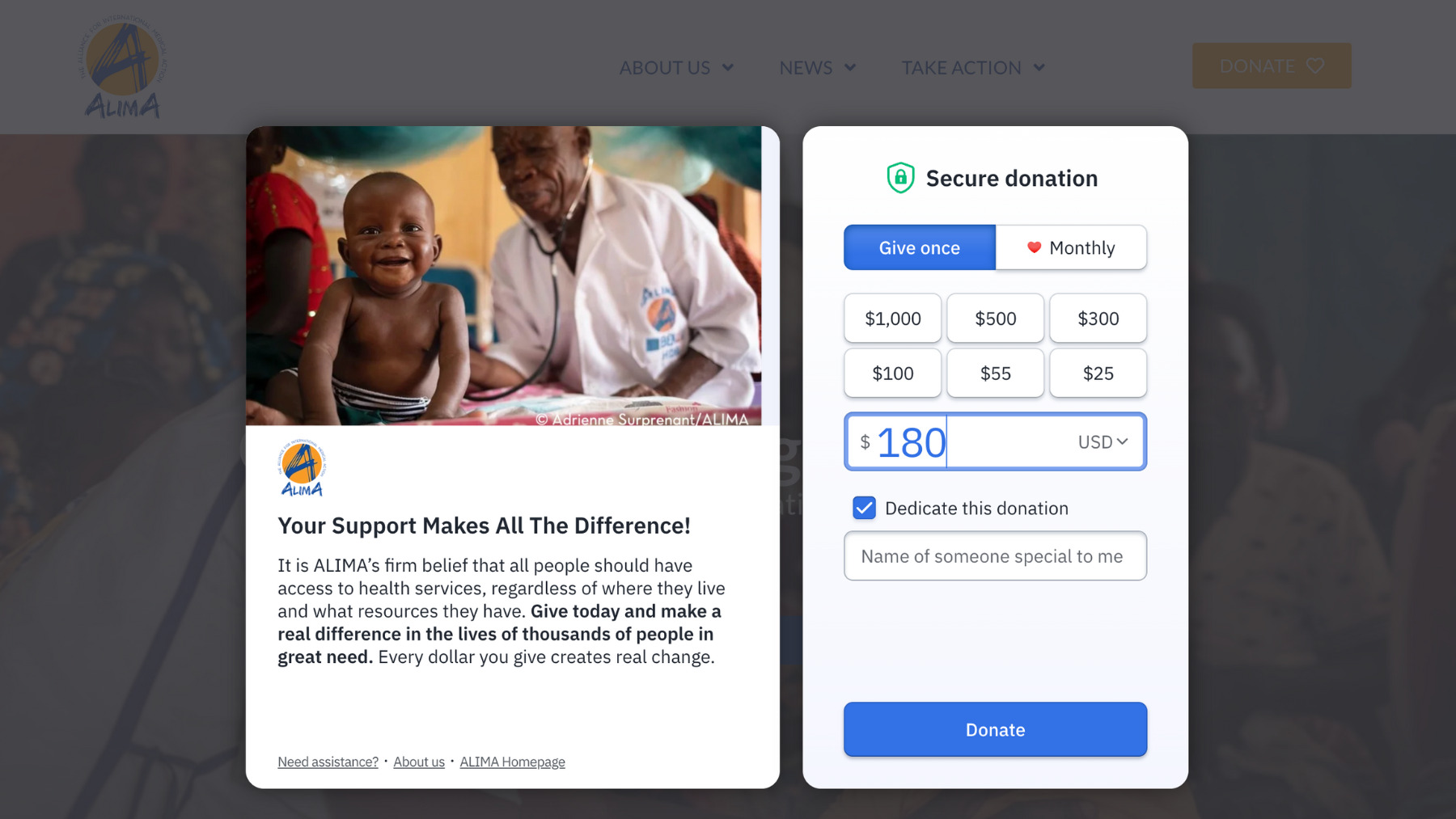
1. A compelling headline and a few lines of copy. Instead of writing lengthy paragraphs, opt for bullet points or short key messages that share the purpose of your social impact campaign, and the impact of a supporter’s contribution.
2. Focal images or short campaign video. Using one or two visuals from your campaign can further illustrate the importance of your cause and the impact a donation will make.
3. Easy to fill donation forms. Embed your forms into your campaign donation page, and, if possible, only ask for essential information like name, email, and donation amount to streamline the giving process.
2. Make it Easy for Supporters to Choose a Donation Amount
Optimize your nonprofit’s donation page to give supporters the flexibility of choosing their donation amount. Provide multiple pre-defined donation suggestions that align with different budget levels, and an option to enter a custom dollar amount. Including these suggested amounts on your nonprofit’s campaign donation page can help guide supporters to make a decision without feeling overwhelmed. As an extra step, consider updating your donation form to give visitors the option to make recurring contributions.

3. Make your Nonprofit Donation Page Easily Shareable
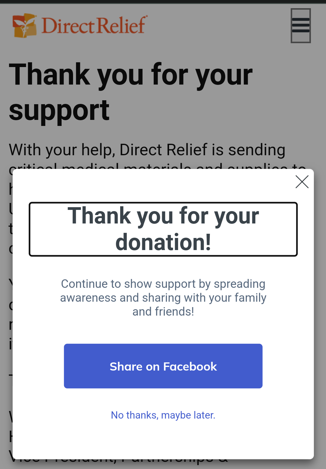
Capitalize on the good feelings your donors have after making a contribution to your nonprofit, and encourage them to share your campaign with others. Optimize your post-donation Thank You page so it includes a “Tell a Friend” feature that allows supporters to spread the word about your nonprofit’s social impact campaign via email, text message, or social media.
An easy way to do this is to integrate share buttons from popular platforms, like Facebook, LinkedIn, and Twitter, to let supporters share your nonprofit’s campaign donation page with their followers. To go the extra mile, create shareable graphics with positive messaging about the action your donor just took. For example:
● “I’m a proud donor of (organization).”
● “Did you know (relevant mission stat)? That’s why I support (organization).”
● “My donation to (organization) helps to (relevant impact).”
● “I just helped (organization) amplify its impact. Join me by making a donation.”

Integrate share buttons from popular platforms
Optimize your Nonprofit Donation Page for a Successful Campaign
There are many hurdles nonprofit marketers face when persuading donors to support their cause. A bad campaign donation page should not be one of them. Optimizing your nonprofit’s donation page to streamline the giving process is essential for a successful fundraising campaign. By following the tips outlined above, you can improve your donor’s experience, increase the chances of recurring contributions, and amplify your social impact campaign’s message to attract new supporters.
This article was written by Paul Katz.


